
BJÖRN
case study
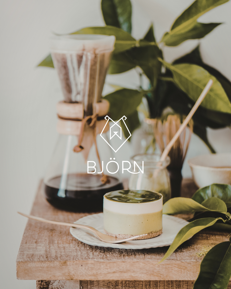
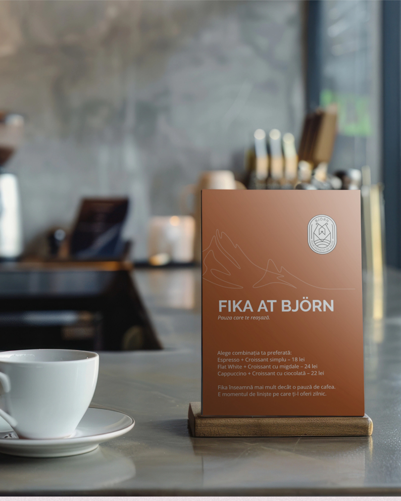
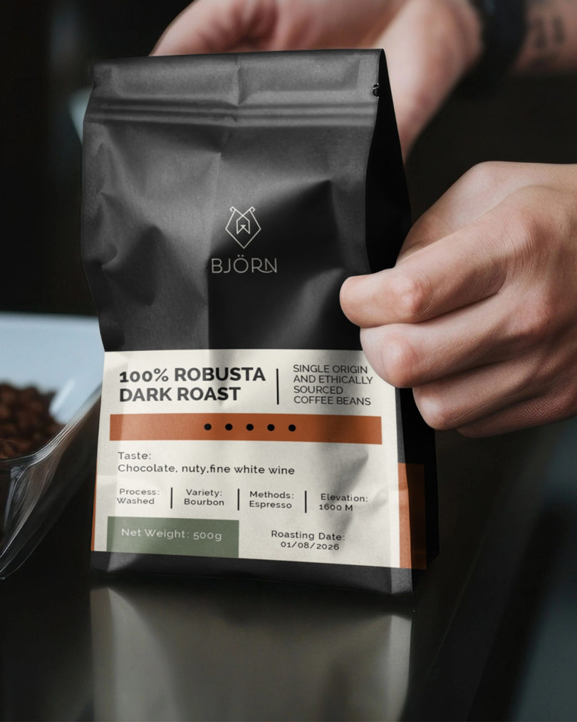
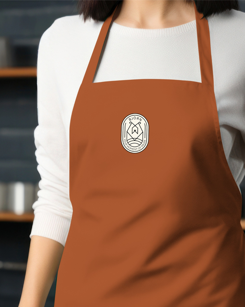
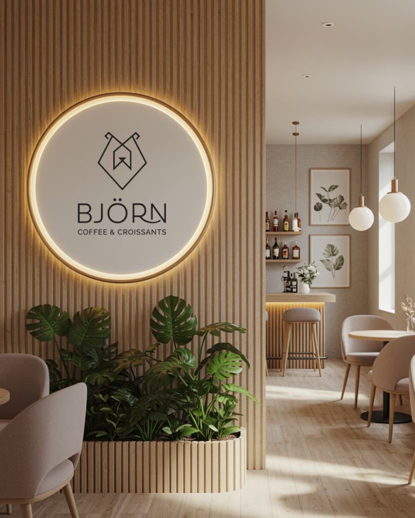
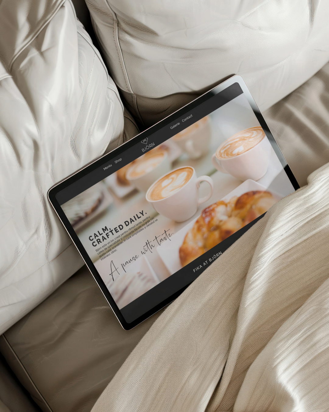
Björn is a specialty coffee brand shaped by Nordic simplicity and the Scandinavian philosophy of slow living. More than a visual identity, the project focused on building a complete brand experience, one that captures balance, authenticity, and the quiet strength of northern culture. From narrative and positioning to sensory atmosphere and visual expression, every layer was crafted to reflect a calm, intentional way of living..
The strategic direction centered on the idea of balanced duality—the tension between powerful forms and soft lines, natural tones and refined details.
The brand narrative was built around the Scandinavian approach to life: slow rhythm, intentional design, and emotional clarity.
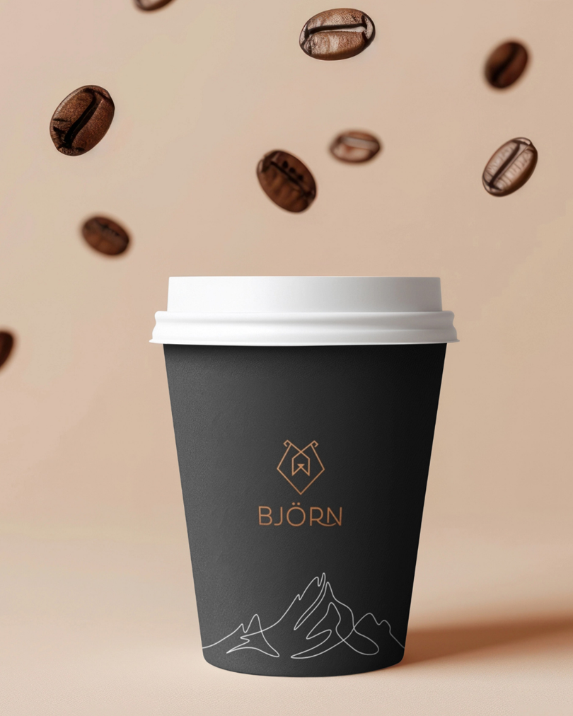
The name “Björn,” meaning “bear,” became the anchor. It symbolizes grounded stability and inner calm, guiding both tone of voice and design choices.

The perfect fit
Let’s work together on your next project!
Some projects are just meant to find the right hands. If you’re building a brand that values emotion, elegance, and intentional growth I’d love to hear your story.