
Rae Celest
case study
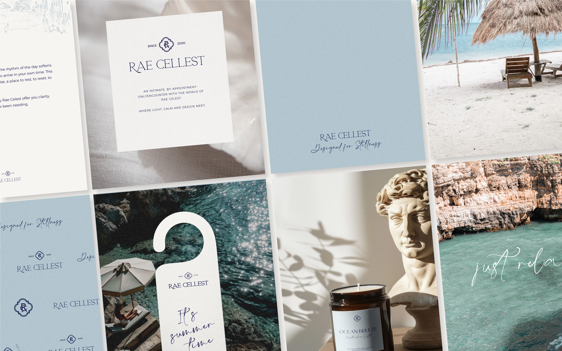
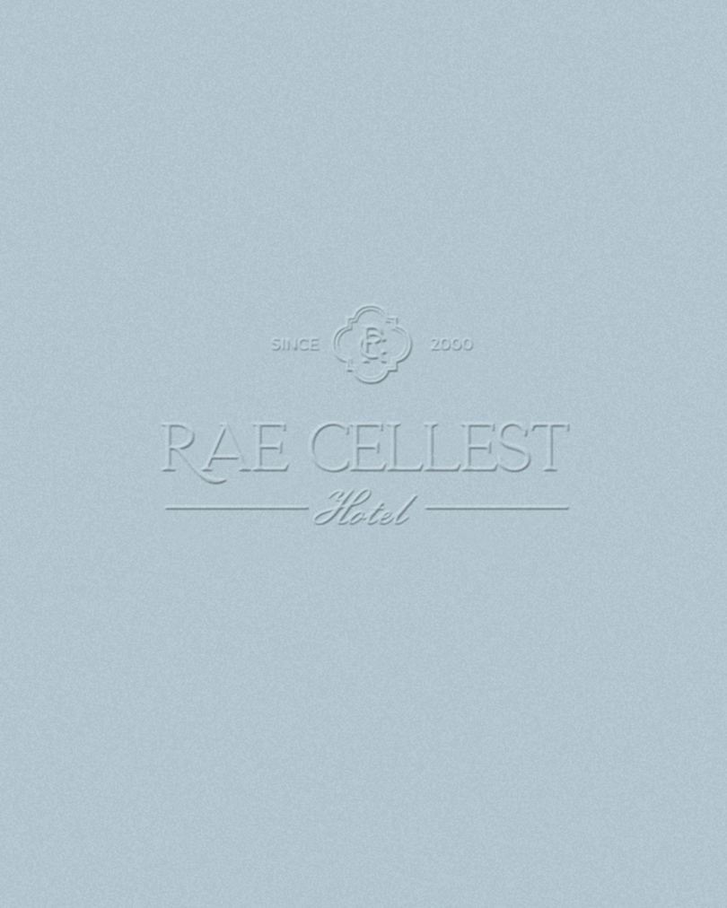
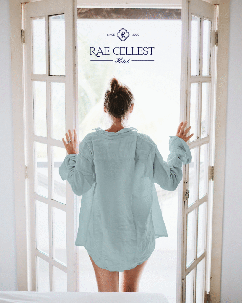
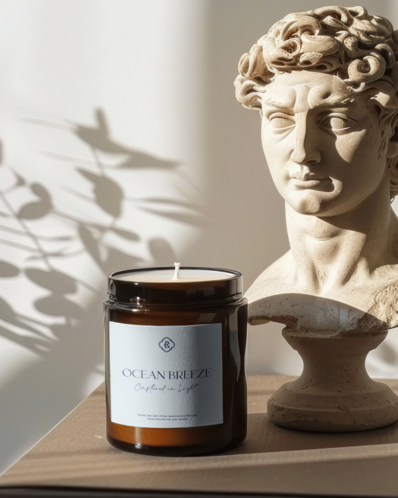
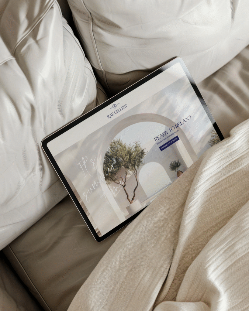
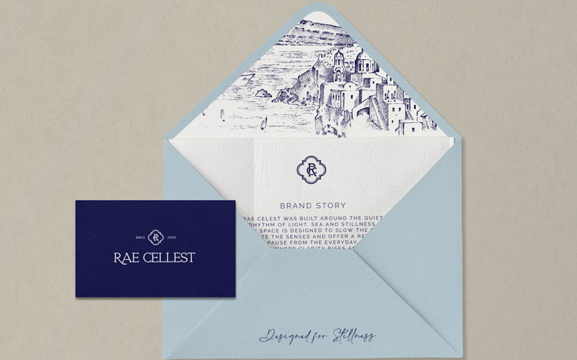
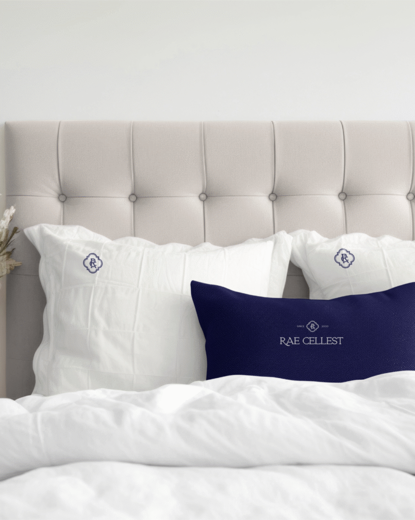
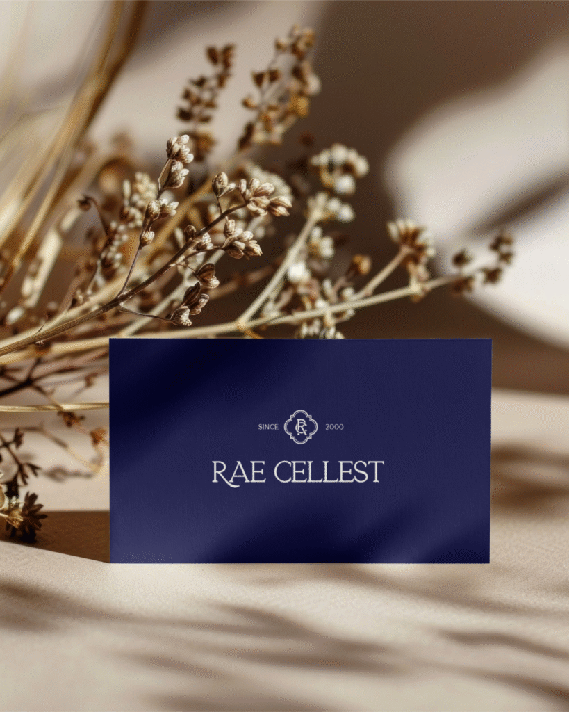
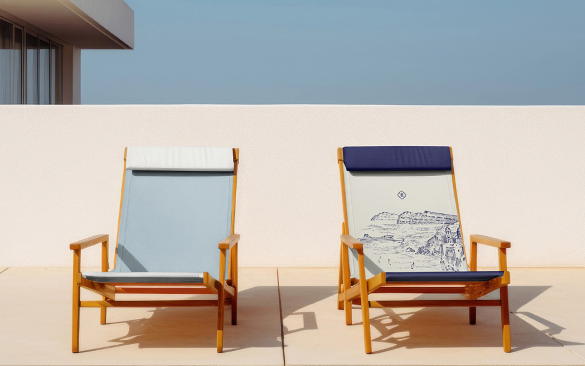
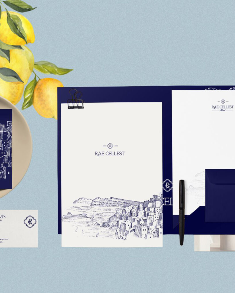
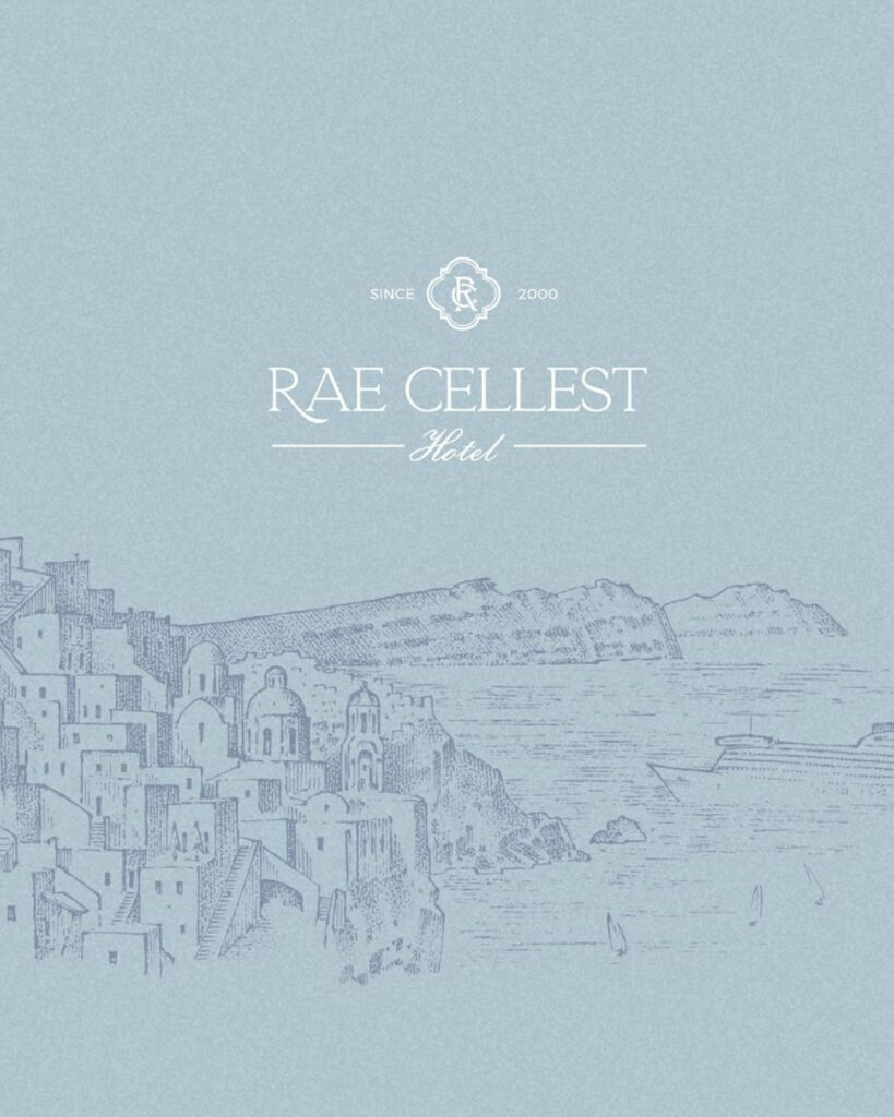
Rae Celest needed a brand that matched the calm, refined atmosphere of the space. The hotel felt premium, yet its communication lacked cohesion. We built the entire direction around The Celestial Rest — a concept rooted in light, balance and intentional stillness — shaping a visual language defined by clean forms, refined typography and a palette inspired by natural stone and soft daylight.
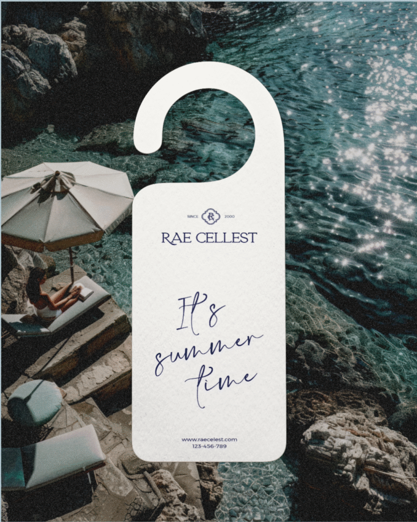
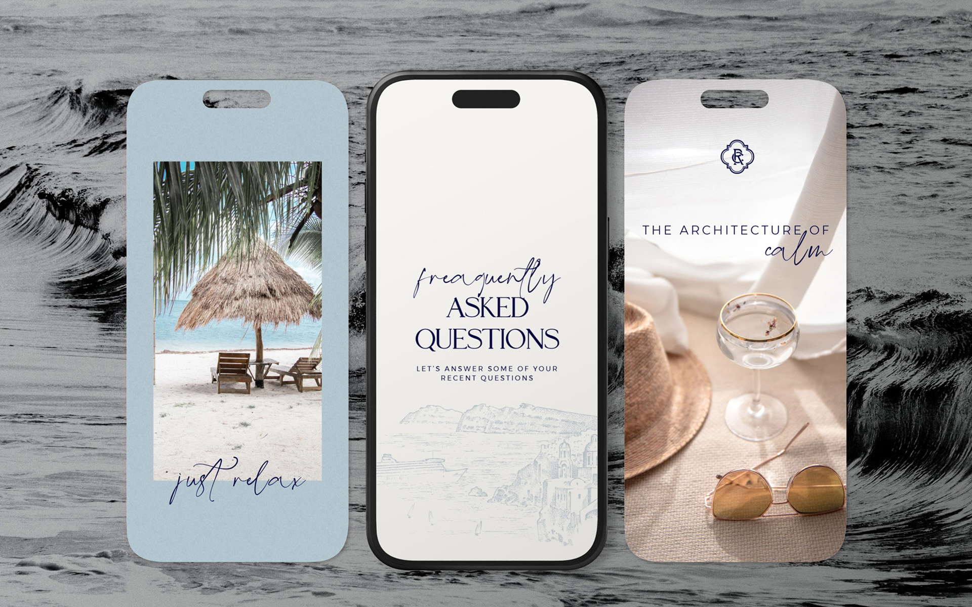
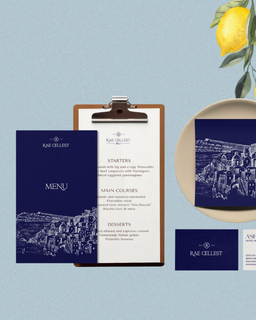
The identity was crafted not only to look elegant but to support the full guest journey. Quiet layouts and minimal aesthetics reduce noise, guide movement and reinforce the sense of modern serenity. The result is a coherent, recognisable brand that feels aligned, intentional and true to the quiet luxury Rae Celest embodies.

The perfect fit
Let’s work together on your next project!
Some projects are just meant to find the right hands. If you’re building a brand that values emotion, elegance, and intentional growth I’d love to hear your story.